GINGKO
PHARMACY
SPRING 2023 // UI DESIGN, UX DESIGN, GRAPHIC DESIGN
Grow old with the ones you love: it’s the key philosophy behind Ginkgo Pharmacy. With the goal of increasing engagement in clinical trials, Ginkgo aims to bring holistic value to people’s lives by making medical information and care more accessible.
RESEARCH
Following a speaker series from professionals in the clinical trial space and conducting some interviews of our own, we were able define three barriers that make clinical trial engagement in underserved communities difficult.
LACK OF KNOWLEDGE
People may not be aware about trials to begin with, or they have a convoluted idea about them.
UNAPPROACHABLE
Information about clinical trials is often saturated and confusing, which can be overwhelming.
DISTRUST
Historical and cultural implications have broken trust with the medical community.
We then analyzed the current pharmacy experience by looking at store layouts, and then synthesizing the information into a journey map that we could improve from. When looking at current pharmacies, we noticed that the environment appeared visually cluttered and confusing at first glance. Areas set up for vaccinations had lacked a solid sense of privacy.
We looked at clinicaltrials.gov as well to see how people could find clinical trials, and how easily there were able to do so through task analysis. There were many barriers (annotated on the screenshot), but the overarching issue is that the platform is not built for the general population. The site was built by and for medical professionals and therefore makes the information less accessible for the people a trial may be aiming to help.
IDEATION
As development of the building
began, we were focused on the idea of transparency in healthcare spaces. Protecting patient data/health while ensuring transparency of practices was the fine line we were walking on.
These sketches (done by Janny Aung and Alex Zheng) are some of the first passes with the space. The sketch with the central atrium better accomplishes the feeling of transparency as the atrium opens the space upon entry.
One key function of the building was how it would add value to the community; we decided that combining programs so the pharmacy could act as a community center by including programs like a cafe, garden, and flex space.
INTERACTIONS
Kiosks in medical spaces are not a new concept, but they are unattractive and bulky, and don’t offer a strong sense of privacy for users.
We designed the kiosks as Ginkgo to ensure that user privacy is protected,
while also fitting into the space elegantly. The small spaces in the wall allow people to see if the kiosk is in use, but they aren’t big enough for people to view the screen.
Once inside the kiosk, users are able to log in and take basic health metrics with the built-in scale, blood pressure monitor, and heart rate sensor provided. All information is then stored directly in their account where they can review it with Ginkgo staff.
The starting screen is designed for a variety of languages. People are greeted with a simple “Hello” in the language they feel most comfortable with and can begin onboarding/login. They also have the option to upload their Ginkgo card to their digital wallet and tap their phone or watch to the screen to pull up their account.
Once logged in, users have three different tabs where they can view their health history, appointments at Gingko, or clinical trial details. The dedicated clinical trial tab provides detail-rich, personalized suggestions and resources for information about clinical trials.
Users are given trial suggestions based on their health history at Ginkgo, and can quickly view a general overview about the trial. Resources pertaining to specific trials are linked so that users can fully inform themselves before talking with a pharmacist at Ginkgo.
Ginkgo’s lockers are accessible via the app for easy and convenient use. Users are able to schedule a pick-up time for prescriptions and, upon arrival, are given the locker their items are in.
The lockers embody the idea of transparency through the materials used, with the boxes placed in frosted glass that peer into the pharmacy work area.
The varying sizes provide options for item sizes, and the heights allow greater accessibility for people in wheelchairs.
PROPOSED CONCEPT
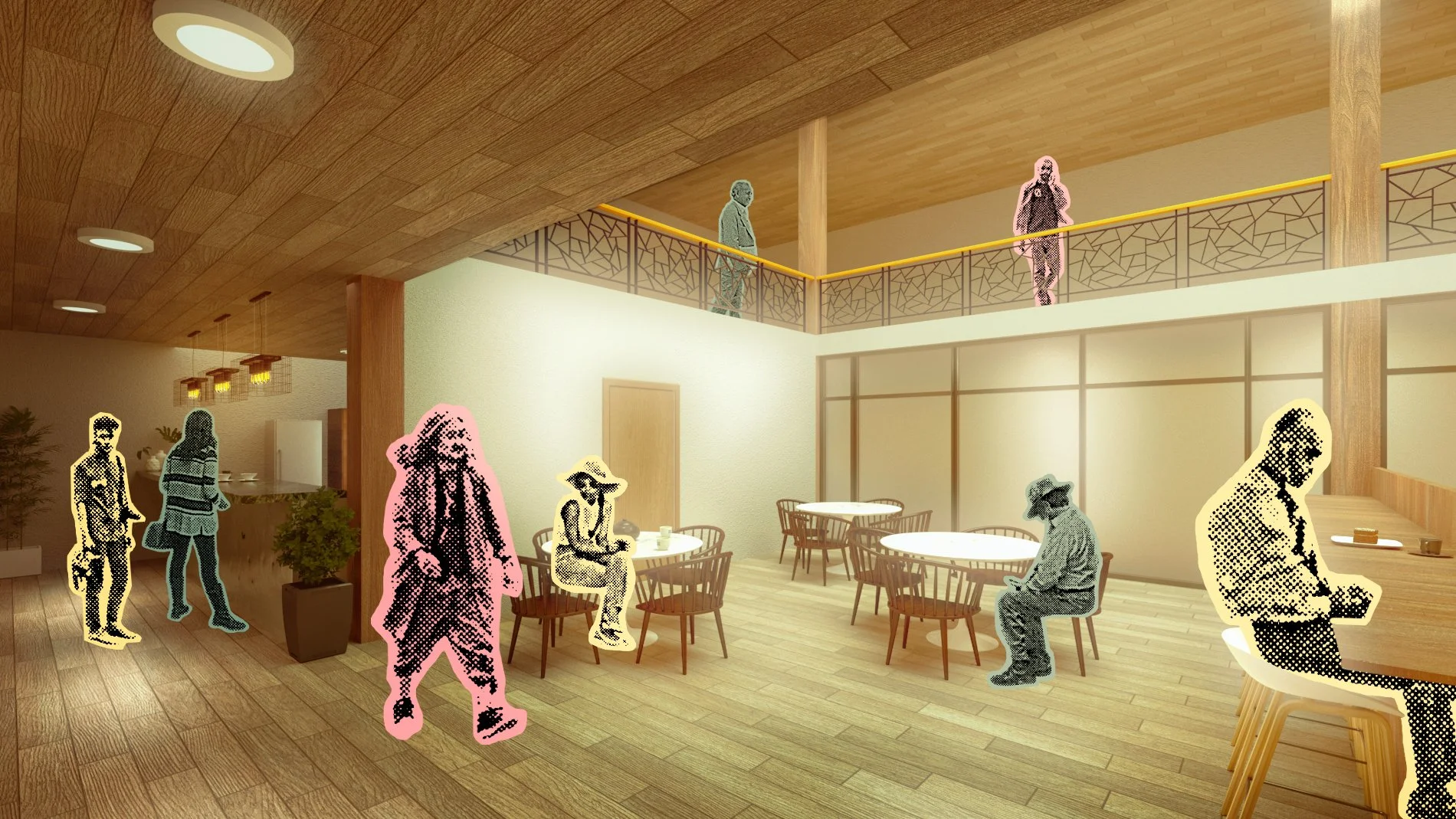
The final proposed space makes heavy use of wood and natural light provided by the central atrium. We were heavily inspired by Asian architecture, which employs both of these elements.
As users move up the building, they become more involved with clinical trial options. The first floor serves as an entry point to the space and introduction to pharmacy and clinical trial activities.
Programs like a cafe and garden draw people into the cafe for conversation, and expose them to the healthcare space without necessarily needing medical care. The exposure alone starts introducing them to the healthcare space to start a discussion.
Visitors have the option for the retail pharmacy on the first floor, which allows them to quickly grab products they may need. They can also quickly consult a pharmacist or staff member about these products.
The second and third floors introduce spaces that allow for conversations about health and clinical trials to begin. Spaces like a cafe and lecture space act as a casual middle ground.
The third floor is set aside for potential SMOs (site management organization) to run trials out of, while the fourth floor has rooms that patients can spend the night in.


